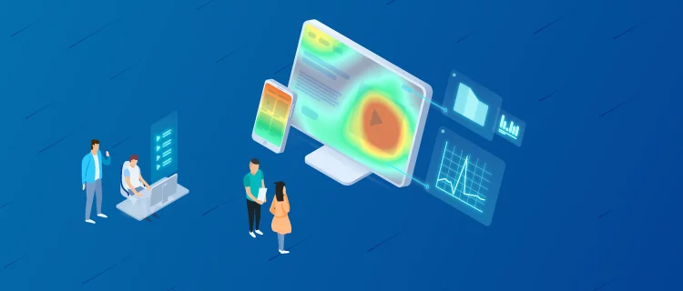
You may already know what heat maps are and why you should use them, but you want to learn how to interpret a heat map to squeeze all the information they offer you and thus adjust the web design based on the needs of users.
Before getting into the subject, we are going to make a brief reminder of what a heat map is.
What is a heat map?
Heat maps or heatmaps are graphical representations that show how your users behave in real time and help you understand the reason for the data on your website. These values are reflected through a range of warm and cold colors that allude to the user’s attention.
So far the brief and theoretical explanation, but how to interpret a heat map? Here’s what the goals are, what the heat map colors mean, and how many types you can find.
How to interpret a heat map?
If you want to know how to interpret a heat map, it is important to first understand what are the objectives sought with this tool and then give coherence to the implementations you make.
Objective of Heat Maps
- Find out which are the most visible elements or spaces on our website
- Detect flaws in web design (and improve its functionality)
- Check if calls to action are getting results
- Evaluate which are the best sites to include advertising
Meaning of the colors of the heat maps
Heat maps use a range of warm and cold colors that respectively indicate the areas of greatest and least interest to the user:
Warm colors (red, orange and yellow) show the elements and spaces in which users interact or pay attention to web content.
The cool colors (blue and green), on the other hand, point out those places where users have barely interacted with the content or to which they have not directed their attention.
Thanks to heat maps we can visually understand how our users behave: where they move, where they click and which parts of the web page they pay more attention to. This information will help us improve the functionality of our website.
However, to effectively measure this behavior, it is essential not only to determine business objectives, but also to complement this information with other relevant data offered by web analysis tools or some of the SEO metrics, such as the number of visits, the rate bounce, browsing time, pages that have been visited.
Types of heat maps
The last point to know how to interpret a heat map is to know the three types of heat maps that exist.
Interaction or click maps
It is a map model that shows the result of the behavior of the users following the clicks that they make. All those elements that call for interaction (buttons, filters, images…) or spaces without elements will reveal how the user has interacted with the web page.
This is the most frequent heat map and the one most used to analyze user behavior, especially on e- commerce platforms where the goal is to maximize the number of clicks on CTA-type buttons that lead to the purchase of a product. or to consult a specific offer. Thanks to these maps, in addition, we can know the user’s navigation route to the purchase and the banners that generate more interest.
On the other hand, interaction maps are very useful to discover which parts of the website need to be optimized and which ones work correctly. For example, if there is an image on a web page that receives a lot of clicks but is not linked to any URL, it might be interesting to link it to some resource of interest.
Mouse movement maps
In this type of maps, the data is not as exact as in the previous ones because the results are obtained through changes in the position of the mouse or touchpad cursor. Without realizing it, we use the cursor as if it were an extension of our eyes and the tool interprets it as an indicator to discover in which part of the page the users spend the most time.
Scroll or displacement maps
The data shown in this type of map is better appreciated in the mobile versions and corresponds to the scroll movement made by the user. They indicate the places on the page where more or less scrolling has been done.
They are interesting to know to what extent users scroll down a web page. For this reason, it is convenient to use them on very long web pages to find out if they can read to the end. Normally, users do not usually scroll to the bottom, so it is convenient to put the most relevant content at the top.
Although these maps are not 100% reliable, it is important to consider them for an analysis of behavior on the website and work on the user interface (UI), user experience (UX) or conversion rate optimization (CRO).
Heatmaps tend to show a shape with the letter F or Z, which corresponds to the reading pattern that a user makes on a website. According to eye tracking techniques, which measure the tracking of the eye when viewing a page, the pattern that is repeated the most is F and denotes that users scan the upper part of the page from left to right, return to the starting point to scan from top to bottom the left part and with a brief glance scan in the central part if something catches their attention.
As the driving force behind WikiPluck, I am dedicated to curating and sharing insightful knowledge across a spectrum of subjects. From technology trends to Business advice, WikiPluck strives to be a go-to resource for those seeking to enhance their understanding and make informed decisions.
Join me on this journey of discovery and enlightenment as we pluck the gems of wisdom from the vast landscape of knowledge.

